
The interior design trends for 2024 are not just about a change in palette. We are witnessing a deeper shift: smooth and uniform surfaces are giving way to textured materials, muted palettes, and materials that have long been relegated to technical uses. This shift changes the way we conceive a living space, from the choice of wall coverings to lighting fixtures.
Textured finishes and artisanal coatings: the surface becomes the decor
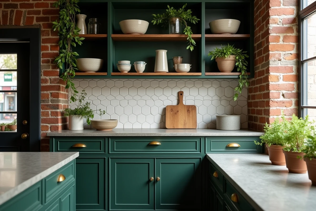
Perfectly smooth walls in matte paint are losing ground. Plaster, lime, and troweled coatings impose irregular surfaces that capture light differently depending on the time of day. This treatment creates a visual depth that no wallpaper can replicate.
You may also like : How to Enhance Your Interior with Incredible House Offers
We recommend reserving these finishes for living spaces where natural light changes throughout the day: living rooms, open-plan areas connected to kitchens. The irregularity of the material also partially absorbs sound, a concrete advantage in large open spaces.
The application requires specific expertise. A poorly mixed lime-hemp coating can crumble within months. A poorly finished stucco loses its shine. It is better to entrust the implementation to a qualified applicator rather than attempting a DIY installation, even on a small surface. To explore other complementary avenues, the decor on Maisons Euro France brings together approaches that align with this direction.
You may also like : The latest business trends you must know to succeed in 2024
Muted palettes in interior decoration: beyond pastels
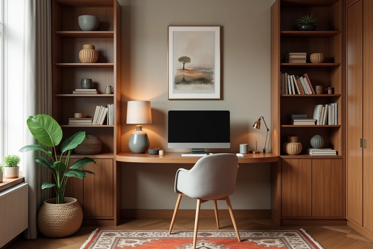
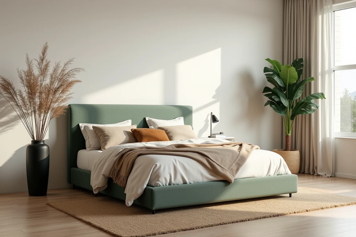
Saturated hues and bright pastels are giving way to enveloping, low-saturation colors. Grayed beiges, soft browns, dusty greens, very muted reds: the 2024 palette resembles more that of an autumn landscape than a candy color chart.
This chromatic choice has a direct consequence on furniture. A midnight blue velvet sofa that worked in an off-white interior may seem dull against a muted brown wall. We observe that the most successful spaces combine a muted color wall with furniture in a neighboring tone but slightly lighter, playing on texture rather than color contrast.
Coordinating wall color and textiles
The rule of a tight monochromatic scheme works better than that of an isolated accent wall. A living room where the cushions, rug, and main wall share the same color family (for example, a dusty green ranging from light to dark) produces a sense of enveloping warmth that high-contrast decors do not achieve.
Be cautious of overly cool LED lighting. A bulb above 4,000 K pulls a soft brown towards gray and kills the desired effect. Favor lighting sources around 2,700 K to preserve the warmth of these palettes.
Cork in interior design: an underestimated material
Wood, linen, and plant fibers have saturated trend articles for several seasons. Cork remains underrepresented in most mainstream content, even though it is making a strong presence in recent design collections and fairs, notably at Maison&Objet.
Cork combines acoustic comfort, a warm touch, and low environmental impact. As wall panels, it reduces reverberations in rooms with hard floors (tiles, polished concrete). As flooring, it offers a flexibility underfoot that hardwood does not provide.
- On walls: raw or tinted cork panels, applied by gluing, that serve both as decor and light acoustic insulation
- On floors: densified cork tiles compatible with low-temperature underfloor heating, provided the thermal resistance indicated by the manufacturer is checked
- As accessories: trays, pendants, plant pots, where cork adds an organic texture without the visual heaviness of solid wood
Sculptural lighting: the fixture as the centerpiece of the living room
Decorative lighting is no longer just about illumination. The fixture becomes a sculptural object that visually structures the space. Crumpled paper pendants, raw ceramic floor lamps, asymmetrical wall sconces: form takes precedence over luminous power.
This approach requires rethinking the lighting plan. A sculptural fixture rarely provides sufficient light for an entire room. It must be complemented by indirect sources (recessed LED strips, accent reading lights) that ensure visual comfort without competing with the main object.
Combining functional and decorative lighting
We recommend separating the circuits. A dimmer dedicated to the sculptural fixture allows it to be used at low intensity in the evening, as a light presence, while functional lighting remains on an independent circuit. This distinction avoids the classic trap: a beautiful object that ends up being turned off because it dazzles at the table.
The choice of fixture material interacts with the wall palette. A washi paper pendant diffuses a warm, soft light that enhances textured coatings. A lacquered metal shade produces a harder beam, suitable for interiors with clean lines but less flattering on a lime-washed wall.
Furniture with organic shapes: choosing curves that age well
Rounded shapes remain present in 2024, but the trend is evolving towards subtle curves rather than spectacular silhouettes. A slightly curved armchair back ages better than a pebble-shaped seat that becomes tiresome after two seasons.
The main selection criterion remains the internal structure. A poorly designed organic-shaped piece of furniture loses its silhouette as soon as the foam compresses. Checking the density of the seat and the presence of crossed elastic straps under the cushion provides a reliable indication of the durability of the shape.
- Low tables with softened edges made of solid wood or reconstituted stone, which withstand shocks better than a molded resin top
- Armchairs with enveloping shells featuring metal or wood structures, where the curve results from bending techniques rather than simple padding
- Wall shelves with curved uprights, which must be securely fixed to the wall (not just drywall) due to the overhang induced by the curvature
The interior decoration of 2024 prioritizes tactile coherence over immediate visual effect. A textured wall, a muted color, a sculptural fixture, and a piece of furniture with a controlled curve share the same principle: the space is discovered through touch as much as through sight. This guiding thread, more than the list of trendy colors, distinguishes a well-designed interior from a dated decor in two years.